Brand Colors 101: How Many You Actually Need
Brand Colors 101: How Many You Actually Need
And Exactly How to Use Each One
You opened Canva. You scrolled through color combinations. You picked five colors that looked beautiful together. You called it your brand palette. Done, right?
Not quite.
Here's what nobody tells you when you're building a brand for the first time: a color palette isn't just a collection of pretty swatches. Every color in your palette has a specific job. A role it plays. Places it belongs and places it absolutely should not go.
When those roles aren't defined, your brand ends up looking slightly different everywhere it shows up. Your website doesn't quite match your social media. Your business cards feel off from your email signature. Everything is close but nothing is cohesive. And that inconsistency, however subtle, is silently undermining the trust and recognition you're trying to build.
Today, we're fixing that. Here's exactly how many brand colors you need, what each one is for, and the simple structure that makes a color palette actually work.
First: A Brand Palette Is Not Just Decoration
Before we get into the breakdown, let's reframe how you think about color in your brand.
Color is one of the most powerful tools in your brand's visual identity. Research consistently shows that color increases brand recognition significantly, and that people form an opinion about a product within 90 seconds — with a large portion of that judgment based on color alone.
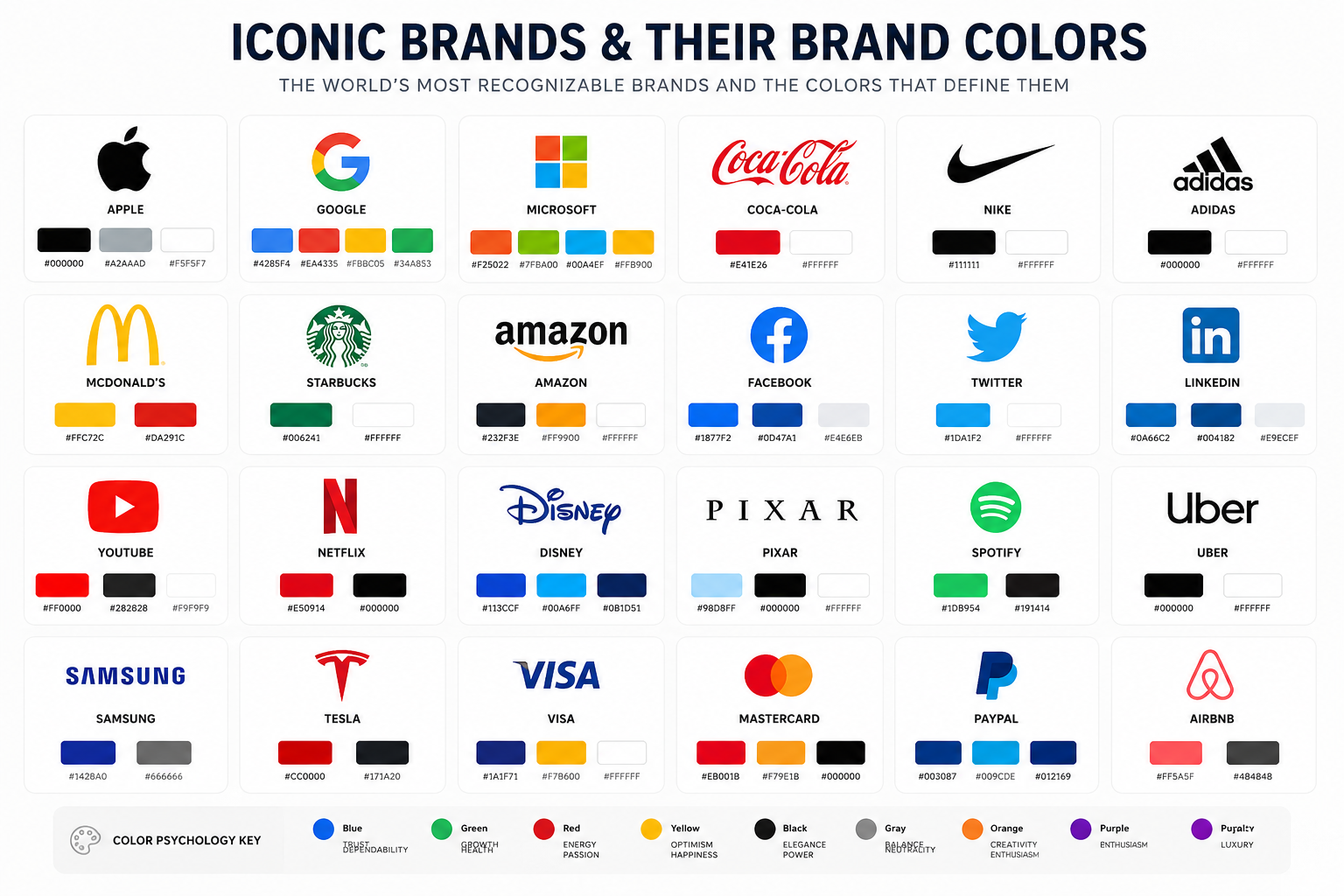
But the power of color in branding isn't just about looking good. It's about consistency. The reason Coca-Cola's red, Tiffany's blue, and UPS's brown are so deeply embedded in our memory is because those brands use their colors with discipline — the same shade, in the same roles, across every single touchpoint for decades.
You don't need a massive brand budget to build that kind of recognition. You need a color system. And a color system starts with knowing what role each color plays.
How Many Brand Colors Do You Actually Need?
The sweet spot for most small business brands is five to six colors. Not two — that's too limiting. Not twelve — that's chaos. Five to six gives you enough variety to create visual interest across all your platforms without losing cohesion.
Here is how those colors break down:
• 1 Primary color
• 1-2 Secondary colors
• 1 Accent color
• 1-2 Neutral colors
• 1 Text color (often overlooked — more on this below)
Each of these is a role, not just a shade. Let's walk through each one.
The 5 Color Roles Every Brand Palette Needs
Primary Color - Your Brand's Signature
This is your most dominant, most recognizable color. It's the one people associate with your brand when they think of you. It shows up the most, carries the most visual weight, and anchors everything else in your palette.
USE IT FOR: Logo, website header, primary CTAs, brand packaging, dominant design elements
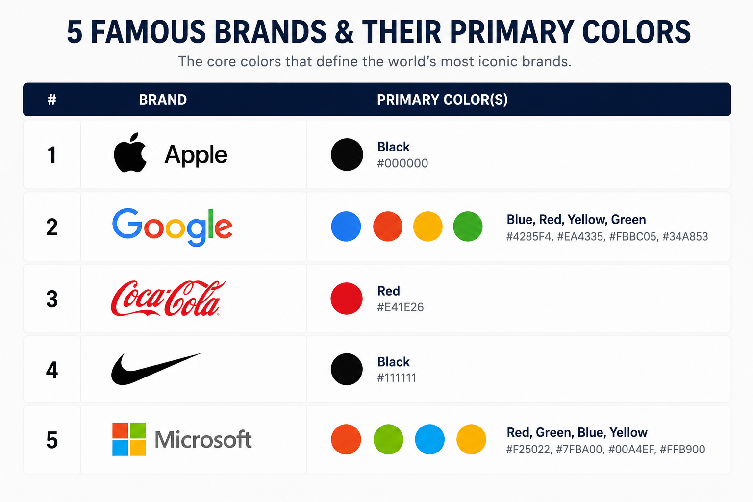
Your primary color should reflect the personality and positioning of your brand. A financial advisor might choose deep navy or slate conveying trust and stability. A wellness coach might go with warm sage or terracotta conveying calm and groundedness. A bold marketing agency might go with electric orange or deep black conveying energy and authority.
Whatever you choose, this color needs to work everywhere: on white backgrounds, on dark backgrounds, on printed materials, and at very small sizes. Test it before you commit.
COMMON MISTAKE
Choosing a primary color you love aesthetically but that doesn't reflect your brand's personality or communicate the right emotion to your target audience. Pretty isn't the goal — aligned is.
Secondary Color(s) - Your Supporting Cast
Secondary colors work alongside your primary to create depth and variety. Think of them as your primary color's closest collaborators they share the stage without stealing the spotlight. You can have one or two secondary colors, but no more.
USE IT FOR: Background sections, supporting graphics, design system elements, secondary buttons, social media templates
Your secondary colors should live harmoniously with your primary. The most common approaches are:
• Analogous — colors that sit next to each other on the color wheel (warm, cohesive feel)
• Complementary — colors opposite each other on the color wheel (high contrast, energetic feel)
• Triadic — three colors evenly spaced on the wheel (vibrant, balanced feel)
You don't need to be a color theory expert to get this right. The easiest approach: use a tool like Coolors or Adobe Color to generate harmonious palette combinations starting from your primary color, then edit from there.
03
Accent Color - Your Brand's Exclamation Point
The accent color is used sparingly — but powerfully. It's the color that grabs attention, creates visual hierarchy, and makes specific elements pop. Think of it as a highlight pen. You wouldn't use it to write an entire paragraph, but a single underlined word makes people stop and look.
USE IT FOR: Call-to-action buttons, pull quotes, icons, key stats or callout boxes, promotional banners, sale badges
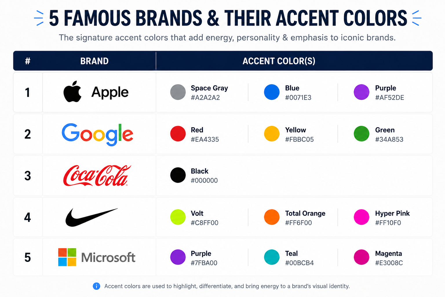
The biggest mistake brands make with their accent color is overusing it. If your accent color shows up everywhere, it loses its power. The accent works because of contrast because it appears against a backdrop of your more subdued primary and secondary palette.
A good rule of thumb: your accent color should cover roughly 10% of your visual real estate. Use it to direct attention. Save it for the moments that matter.
04
Neutral Color(s) - The Breathing Room
Neutrals are the unsung heroes of a brand palette. They give your design space to breathe. Without neutrals, every layout feels loud like every element is competing for attention at once. With the right neutrals, your other brand colors have a clean stage to perform on.
USE IT FOR: Page backgrounds, card backgrounds, whitespace areas, email backgrounds, presentation slide backgrounds, text areas
Most brands use one warm neutral and one cool neutral to give themselves flexibility depending on the mood of the layout. Classic choices include:
• Off-whites and creams (warm, approachable, editorial)
• Light grays and silver tones (clean, modern, corporate)
• Warm taupes or beige tones (grounded, lifestyle, premium)
• Deep charcoals or near-blacks (bold, editorial, high contrast)
Avoid using pure white (#FFFFFF) and pure black (#000000) as your neutrals if you can. Slightly off-white and near-black are almost always more sophisticated and easier on the eye.
05
Text Color — The One Most People Forget
Here's the color role that almost every DIY brand palette leaves out: a dedicated text color. And its absence shows up everywhere in inconsistent font colors across different platforms, in body copy that's too dark or not dark enough, in headings that don't contrast well enough against their backgrounds.
USE IT FOR: All body copy, headings, captions, labels, form fields, navigation text
Your text color should be defined as part of your palette and applied consistently everywhere text appears. It's typically a very dark shade but not pure black. Pure black on white backgrounds creates a high-contrast harshness that reduces readability over long passages.
A deep charcoal, dark navy, or rich espresso brown often works better. Whatever you choose, ensure it meets accessibility contrast standards: at least a 4.5:1 contrast ratio against your background colors. Tools like WebAIM's Contrast Checker make this easy to test.
A Quick Word on Light vs. Dark Versions
Once your color palette is defined, you will also need light and dark versions of your key colors for specific contexts. For example:
Your primary color on a white background does it have enough contrast?
Your primary color reversed out in white on a dark background does it still read clearly?
Your neutral colors do you have both a light option for backgrounds and a darker option for cards or panels?
Most brand designers will define these variations for you and deliver them as part of a full brand kit. If you are building your own palette, plan for at least one lighter tint and one darker shade of each primary and secondary color.
Where This All Goes Wrong: The 3 Most Common Brand Color Mistakes
Mistake 1: Too Many Colors
More colors feels like more creativity. In practice, it creates visual noise. When everything is colorful, nothing stands out. Cap your palette at six colors maximum and be disciplined about using each one only in its designated role.
Mistake 2: Inconsistent Hex Codes
This is one of the quietest brand killers: using slightly different shades of the same color across different platforms because you're eyeballing it instead of using exact hex codes. Your Instagram blue should be the same hex as your website blue as your business card blue. Write your hex codes down. Keep them somewhere you can reference every time you create anything.
Mistake 3: Choosing Colors You Love Instead of Colors That Serve Your Audience
Your brand colors are not about you they are about how your ideal client feels when they encounter your brand. If you serve corporate executives, pastel mint and blush pink may not create the trust and authority they are looking for. If you serve lifestyle-oriented wellness clients, dark industrial tones may feel cold and inaccessible. Design for your audience first. Your personal preferences are secondary.
Your Brand Color Checklist
Before you finalize your palette, run through this list:
1.Your primary color reflects your brand personality and speaks to your target audience
2.Your secondary colors complement your primary without competing with it
3.Your accent color is distinct enough to grab attention — but you have committed to using it sparingly
4.Your neutrals give your layouts breathing room and a clean backdrop for your other colors
5.Your text color is defined, accessible, and applied consistently everywhere copy appears
6.All hex codes are documented in a brand kit or style guide
7.Every color has been tested in both digital and print contexts
8.Your full palette has been tested against itself for cohesion — not just individual swatches, but the full system together
Brand Colors Are a System, Not a Selection
Here is the shift in thinking that changes everything: your brand colors are not just colors. They are a visual language. And like any language, they need structure, rules, and consistent application to communicate clearly.
When your color palette has defined roles and you apply them with discipline, something happens. Your brand starts to feel intentional. Clients begin to recognize you before they even read your name. Your designs become easier and faster to produce because you're not making color decisions from scratch every time.
That is what a real brand identity does. It makes every design decision easier because the system has already made it for you.
At Forward Creative, building that system is exactly what we do. From color psychology and palette development to the full brand identity logo variations, typography, brand kit, and beyond we create brand identities that help small business owners show up with consistency and confidence across every platform they occupy.
Explore what a full brand identity partnership looks like at forwardcreative.co.
Because your brand deserves more than a mood board.
It deserves a system built to scale.
Explore what a real creative partnership looks like at forwardcreative.co.
Because the question was never whether you have something worth saying.
It's whether you have the strategy to make the right people hear it.
Related Blog Post:
